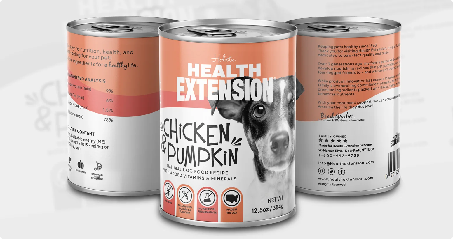
The Health Extension Chicken & Pumpkin Dog Food packaging was designed to communicate trust, nutrition, and care for pets while maintaining a clean and professional retail appearance. The goal of the design was to create packaging that instantly conveys quality ingredients and holistic pet health, helping pet owners feel confident about the food they are choosing for their dogs.
The visual identity uses a warm peach and soft orange color palette, creating a friendly and approachable feel while also standing out on store shelves. These colors evoke warmth, nourishment, and natural ingredients, reinforcing the brand’s focus on wholesome pet nutrition. The smooth wave elements across the label add movement and balance, giving the design a modern and polished look.
A prominent black-and-white dog portrait is placed on the front of the packaging to build an emotional connection with pet owners. This visual instantly communicates the product’s purpose and helps the packaging feel more personal and trustworthy. The large and bold “Health Extension” typography ensures strong brand visibility, while the hand-drawn style of “Chicken & Pumpkin” adds a friendly, natural touch that reflects the wholesome recipe.